Update: Mosaic closed Oct. 27-30 for upgrade, new interface debuts Oct. 31
Mosaic will be unavailable due to a scheduled upgrade from Thursday, October 27 beginning at 6 p.m. until 8:30 a.m. Monday, October 31. ALL Mosaic systems will be closed during this time.
The upgrade will include a new user interface for parts of Mosaic, making the system more mobile friendly. While the system will gain a new look, tasks and processes will stay the same.
The October upgrade will focus on human resource and the user interface. It is the first in a series of upgrades scheduled for the next year.
Upgrade timeline
- October: HR functions and interface (system closed Oct. 28, re-open Oct. 31)
- December: Finance functions (system closed first weekend of December)
- First quarter 2017 (tentative): Advanced reporting (data warehouse)
- First half 2017: Database upgrades
- Fall 2017 (tentative): Student administration functions
Background
As outlined earlier this year in the Daily News, the Mosaic upgrade program will allow McMaster to take advantage of bug fixes and features in the new versions of the PeopleSoft software Mosaic is built on; and to keep the University on vendor supported versions of the underlying software. This upgrade will position the University to adopt additional features in the future.
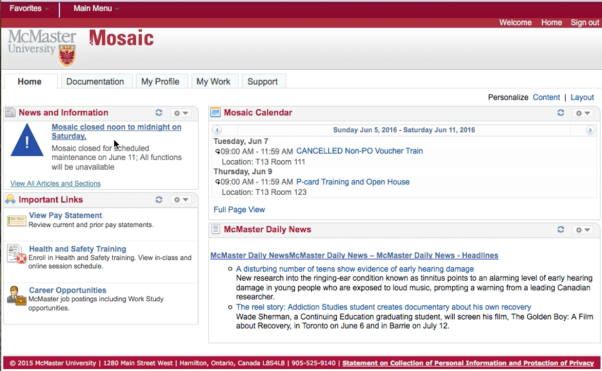
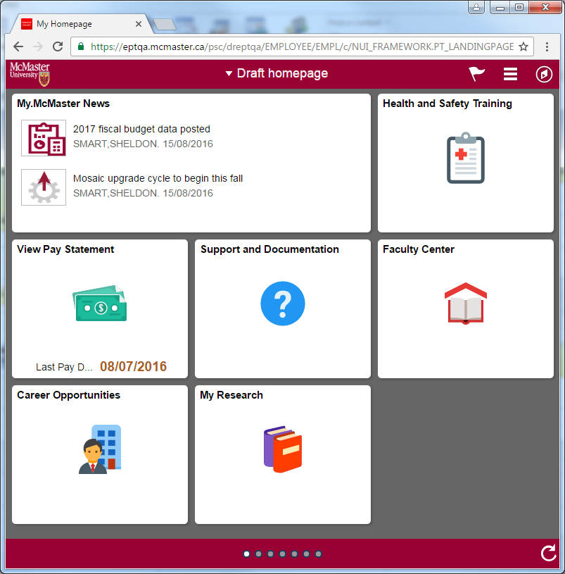
When the first upgrade debuts on October 31, the most noticeable difference will be a new user interface. Comparable to the difference between Windows 7 and Windows 10, the new interface is more mobile friendly and that provides end users with some options to personalize Mosaic.
During the interim period between the first upgrade and final upgrade, users may find themselves shifting between the old and new user interface within Mosaic. The new interface will gradually be deployed to other parts of the system through 2017. As well, users should expect additional functionality to be deployed in the months after a component is upgraded.
Orientation/Training
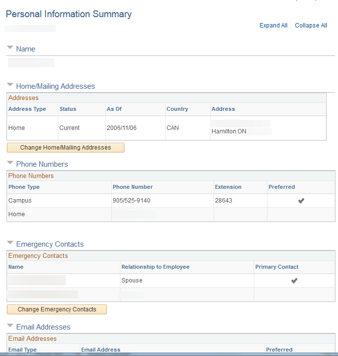
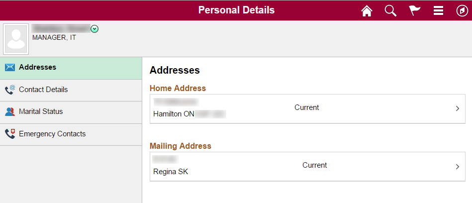
While the interface looks very different (see screens below); in almost all cases the steps required to complete a task remain the same. Consequently users will only need to familiarize themselves with the new interface. Explanatory videos, printable guides and drop-in session to explain the upgrade will be available for the October debut. For users who prefer a classroom-style learning opportunity, drop-in sessions will be held on:
- Oct. 24 from 11 a.m. to 2 p.m. in BSB 241
- Oct. 25, from 1 p.m. to 4 p.m. in BSB 241
- Nov. 1 from 1 p.m. to 4 p.m. in BSB 241
- Nov. 2 from 1 p.m. to 4 p.m. in BSB 241
- Nov. 3 from 2 p.m. to 4 p.m. in T-13 111
- Nov. 4 from 10 a.m. to noon in T-13 111
Earlier feedback
Finally, the Mosaic team would like to thank the approximately 200 users from across the university who attended the summer’s previews of the upgraded system and provided feedback which is currently being incorporated into the system. Their questions and comments helped the team refine the system and adapt it to the specific needs of McMaster users.
Frequently Asked Questions
Are we replacing Mosaic?
No. This is an upgrade of the existing, PeopleSoft-based system. The majority of administrative processes will stay the same. The most noticeable change will be the mobile-friendly user interface.
Will it be like the launch of Mosaic?
This will be a much smaller, less disruptive project. Spreading the upgrade over a year in a series of incremental steps will also reduce the impact to end-users.
Isn’t it too early to do this?
McMaster is pursuing a strategy of frequent, smaller upgrades with an eventual goal of upgrading every 12-18 months. It has been three years since the first piece of Mosaic launched, so this fall is an appropriate time to begin.
Is mobile really so important?
This upgrade is primarily about improving the underlying technology and providing the University with the option to adopt new features. The mobile interface is just the most visible manifestation but given the growing importance of mobile use, especially among students, it was an obvious feature to adopt immediately. (The University has seen mobile usage on its website go from about one percent to almost 20 percent of users in the past five years.)
What will the new interface look like?
Below are two examples of a current view in Mosaic and a possible future design. The future look is still evolving and these pages may change.
Current Mosaic homepage
Future homepage design
Current view of personal information summary
Future design of personal information summary


